PostNL
Short internship
How to improve the UX of the Post- Brievenautomaat?
My design challenge was to improve the UX of the new letter machine of Postnl. Users can send and receive packages with the machine. Postnl made the machine to decrease the traffic in the centre of Amsterdam and other big cities. By using the PBA, mail deliverers only have to drop their mail at a PBA at central points instead of driving to several addresses in a city.
The most challenging thing in my internship was that I, next to my classmate Tevin, was the only UX designer at Postnl. This caused that I had to explain and substantiate my ideas very clearly.
In the process we covered five phases:
1. Empathize
In this phase, we did empathizing techniques with our users. For example, I went to the distribution centre in Amersfoort to get to know the Postnl mailmen.
2. Define
We defined the problems of our stakeholders.
3. Ideate
We ideated for new ideas and also looked at the work of previous designers who worked at Postnl.
4. Prototype
At the left, you can see one of the prototypes I built, while tested with eye-tracking techniques.
5. Test
Not only did we do eye-tracking (as you can see in the video), but our tests also included paper prototyping, Wizard of Oz, Usability Testing and Gamification.
Jaqueline Sips
Supervisor

Sophie showed me in several sessions very clearly how she got to certain design choices and why she thought those choices needed to be made.
Reflection
PostNL Rating
"Sophie was a bit shy at first. But, the more she got into the assignment, the more she flourished. She knew pretty quickly how she would approach a problem and how she would manage her tasks. During her internship, she was very clear in communicating her results and the things she needed to take the next step in her process.
We loved working with Sophie because she is a very open and honest person. We really appreciate her hard work and enjoyed her drawings very much."
Project rated by Harry Zengerink and Jaqueline Sips
8/10
Thesis
Proposition visualisation Gradient
For my thesis, I made a visualisation of the proposition of Gradient - a digital agency I worked at the time.
A lot of employees and the management team weren't on the same page anymore about what it is that Gradient does, or who does what, or how it all works together. This was caused by a lot of internal changes and a new company strategy - with just a few communication errors in between.
To get everyone on the same page again, I did a lot of user research and visualised the outcome in an interactive prototype (see video).
Even though it was a very tough challenge I got rewarded with 9/10 points at the end.


My thesis supervisor and UX Expert
Parisa Khanipour

My thesis supervisor and UX Expert
Parisa Khanipour
Thesis
Proposition visualisation Gradient
"Sophie did a great job talking to different stakeholders involved to make sure the designs reflect the needs and requirements of different user groups and internal stakeholders, making compromises between simplicity, usability, and comprehensiveness, and delivering a product that is up to the challenge. She kept a positive attitude throughout and she was a joy to work with."
Rated by Jan Jaap Rijpkema
9/10
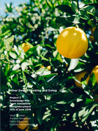
Design thinking project for Knowledgemile
Take a look inside a design document
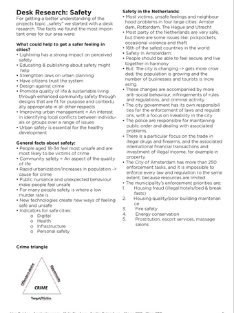
In 2018 Knowledge Mile BIZ approached me and the team about how to enhance and ensure safety in and around the Knowledge Mile area. While designing for safety we kept in mind we were able to influence two kinds of safety: actual safety and perceived safety. While actual safety is about crime statistics or the number of traffic incidents, perceived safety is about how safe someone feels. During this project, we used Design Thinking to improve the perceived safety of the people in the Knowledge mile.
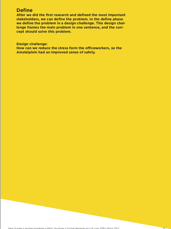
By applying the research phases Understand, Empathize, Ideate, Prototype, Test we designed an interactive installation functioning as a sitting area. We tested the prototype in real life and presented the results to the members of Knowledge mile in Amstelpark.
In the document, you can read all about our approach, research findings, and results.
Pathe Cinema redesign
commissioned by Cobra Systems

My colleagues and I did a redesign for the Pathe cinema website. It was essential to create a better flow for visitors to reserve a seat and to make the website look better. To do so we first created a better hierarchy by aligning titles and text, and by creating consistent buttons and links. Next, we created some shortcuts for users who already know the website and shortened the flow.
Even though Pathe still didn't publish all the designs yet, I am happy with the results and how we worked as a team.


